
A Genre-Bending Tropical Mobile Experience
Paradise Fortune Casino (PFC) was an R&D project designed to redefine the virtual casino experience by combining enhanced slot mechanics with a tropical resort renovator. The goal was to create a layered casino journey, encouraging players to dream big and win bigger.
As lead visual designer, I led the logo creation, curated the style guide and brand bible, and worked with the Art Director and department heads to integrate PFC’s brand identity across the UI, marketing materials, and App Store.

The Player’s Pick
After weeks of iteration, sourcing options from vendors, and generating our own in-house designs we developed a categorical winner!
Theme & Game Type
The overwhelming majority of respondents felt this logo direction captured the tropical theme and slots identity of PFC.
Style & Quality
Scoring ~30% higher favorability than other logos in the category, respondents really resonated with this vibrant visual direction.
Click-Thru Rate
With a goal of reaching 20-30% conversion on our click-thru rates, respondents favored this approach above the other logo options.
My Role Creating the Brand Identity
(Character and content illustrations created by the talented game art team.)
PFC Brand | Concept Pitches
The Runner Up
Although respondents liked the family crest concept, the luxury-resort-inspired design did not poll as strongly as the winning logo did with PFC’s core audience.
PFC Brand | My Logo Drafting Process
My Brand Design Goals
PFC Brand | Fonts
PFC Brand | Palette & Key Textures
Mixing playful font styles, lush flora, tactile textures, and classic googie silhouettes created a playful blend of tropical branding that resonated with slot players and highlighted the vibrant charm of PFC's island paradise.
PFC Brand | Island Metagame
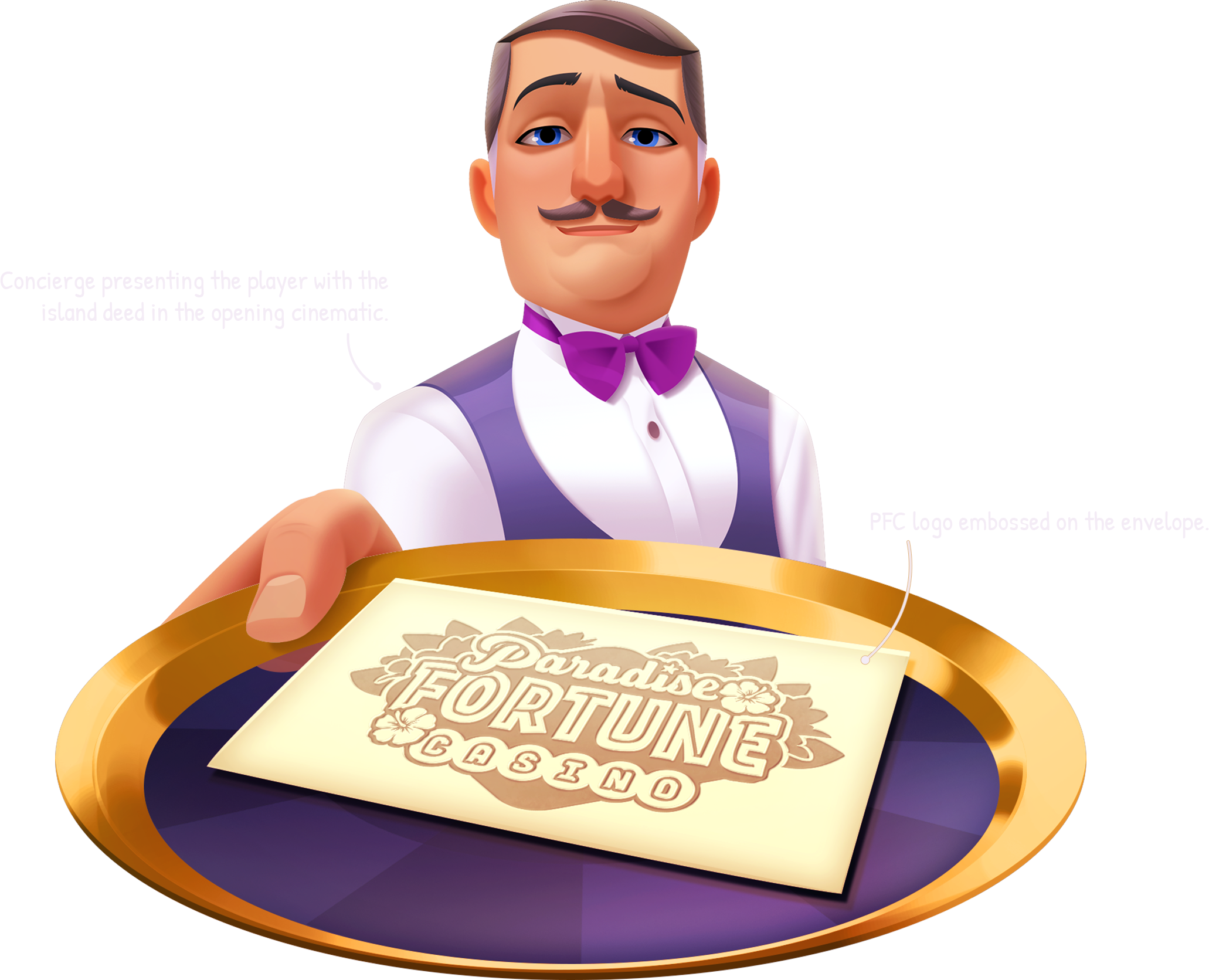
Integrating the brand into PFC’s island metagame helped visually unify the gameplay experience. The brand emblem, tied to the island’s renovation story, marked quests, decorated interactive buildings, and added narrative charm to the player journey.
PFC Brand | App Store Icons
The goal for PFC’s app store icon was to stay thematically relevant and slots-focused. Out of dozens of variations, these four performed the strongest. The top design, featuring PFC’s host Phoebe, achieved 60% favorability, with the runner-up at 25%.
Alternative Logo Colorways
I created print-friendly versions of the PFC logo to expand branding across all channels. The limited and premium colorways were used for company merchandise, while the single-color version enhanced playful narrative moments in-game.
Brand Integration & Production Rollout
With the new brand polished and user-tested, the final step was integrating PFC’s brand identity into the game development pipeline. To ensure visual consistency and quality, my team and I created the 'Giga Guide'—a comprehensive visual summary to streamline development. I consulted with the head of games and department directors for feedback, secured stakeholder buy-in, and led the guide's creation with my design team. Below is a snapshot of how the guide came together.
The ‘Giga Guide’s’ Impact
By creating a centralized visual library, we improved production times, enhanced asset quality, and delivered a more immersive brand experience. The success of the 'Giga Guide' framework led the studio to implement it across other game pipelines.
The Work displayed here is the intellectual property of Aristocrat Technologies.
© 2024 Aristocrat Technologies. All rights reserved.


